 Have you noticed the new Los Angeles City street signs lately? The Militant has!
You can find them along the 1st Street corridor in Downtown Los Angeles, in the Civic Center and Little Tokyo areas. The aluminum signs are slightly larger than the current city street signage and have "wings" on the top and bottom, displaying the City Seal on the top wing and the block number and direction on the bottom wing.
These signs aren't all that new; they were first spotted in June of 2009, like the Main Street sign pictured above left. You would have expected The Militant to do a post on the signs back then, but he
 This week, though, The Militant noticed more of these signs popping up - this time outside the Civic Center, like this sign (pictured right) on 1st and Alameda.
When he first saw the signs nearly two years ago, he thought they were kind of strange, mainly because of their UFO/Chevrolet logo shape, but admittedly, they have grown on him. They're large, and have larger lettering, which means they are more visible to motorists and pedestrians (and cyclists, too, of course) alike. Second, they are the first Los Angeles street signage to acknowledge the City of Los Angeles outright. Very important in this region of nearly 90 suburbs, satellite cities and unincorporated areas, of which street signage is the one of two tell-tale ways to know exactly which city you are in (calling 9-1-1 and seeing which police department shows up is the other, but The Militant doesn't recommend you do that...).
The street signs are the first new signs to pop up on Los Angeles streets in some 25 years, and are now the 5th commonly-found street sign type in town. It would be awesome if our City's street signs were all eventually uniformly updated to this one (though with the City budget ish, keep dreamin'...of course, the City can probably make some sweet revenue selling the old street signs for $50-$100 a pop, but you know an idea like that won't go nowhere in the City's bureaucracy...). Here's a little historical primer of Los Angeles street signs from the past several decades:
 The "Shotgun" Sign (made 1946-1962) - Supposedly called because of the resemblance of the sign's shape to a shotgun, these signs are the oldest common street signs found in Los Angeles (though older ones still exist in various spots). These porcelain signs feature two faces and a hollow center. They are black with white upper-case block lettering, and the street type and direction contain a period at the end of the abbreviation. Though over 60 years old, these signs are the second most-commonly found street sign type in the City.
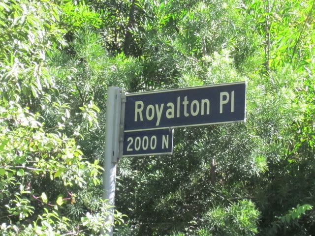 The "Black Blade" Sign (1967-1973) - These signs were made of aluminum and came in two pieces: The larger one with the street name and type, and a smaller one below with the block number and direction. Note the lack of the period at the end of the abbreviation. Also, these signs are supposedly the first street signs in America to feature lower-case letters. The lettering and border trim are made of reflective material for better visibility at night. BTW, Royalton Place is up in the hills near Coldwater Canyon Drive.
 The "Trapezoid" Sign - (1985-Present) Unlike the previous two designs, this sign features the street name, type, block number and direction on the same piece. Made of porcelain-coated steel (with a thin hollow center), this particular sign type started appearing in 1985 and is the current and most commonly-found street sign used in Los Angeles. The angled outside edge of the sign gives it a trapezoidal shape.
Of course, this primer only covers the standard street signs placed on street corners and not the larger motorist-oriented boulevard signs that hang from traffic lights. That would be another post for another day. But you might want to check out this experimental LED boulevard sign in Downtown that the city sprang $3,000 for (the regular ones only cost $70)! But now you know all about Los Angeles' street sign types (dare The Militant say, you're now, "Street Smart?"), and you will surely now become The Life of the Party* with your newly-gained militant knowledge!
* You know The Militant is!
83 comments:
Wow that's a whopping price in street sign investment! But what's the big difference in using LED signs to ordinary reflective signage? I guess they appear clearer at night. But just imagine how much it would cost to put up an LED sign on every street corner.
Thanks! Very interesting primer. What's your research source on the street sign history?
I wouldn't be surprised is the FHWA is behind the new signs. I recall a change came out this year requiring mixed case (that really affects NYC), which probably led to an impetus to replace the oldest type of signs.
Its also worth noting that the shotgun signs are often used by small birds as houses.
Excellent post. Make me alomst wonder if the Militant may or may not be LA City Nerd.
Actually, I did some research on this. This is a federal requirement and none of L.A.'s current street signs (other than the brand new ones) fit the bill. So over the next 5 years the city will be replacing *every* (or, supposedly, every) street sign in the city with the new Chevrolet-logo-shaped signs, with smaller versions (with no City logo) on side streets.
I'll miss the shotgun signs the most! And the City won't put them up for sale, either. They'll be recycled for scrap.
The "Shotgun" signs are the best, and should be preserved. The new ones are the worst. It is sad that the government wastes our money changing signs like this. Just keep what we had, and preserve our history and heritage.
There are some that have a really old font on them (that I presume to be from the '20s) esp. in Hollywood and the southern SFV. What's their story?
Anonymous here (no reason to be anonymous, just clicked the wrong button).
Would anyone be willing to petition the City -- or even the FHWA -- to "Save the Shotguns"? No reason to junk history because the Federal government feels aging baby boomers can't read in all caps.
I'm anonymous #1, to be clear :-)
what about the oddly unique street signs on Wilshire and Western. They have a different font than any of the other signs in the area, and the only other intersection (that I've seen) with this font is Wester and Olympic. Does anyone have any idea as to what this is about?
HollywoodF1: The Militant found scant info on the sign generation before the "Shotgun" types - They were black rectangular signs with white upper-case lettering that did not contain the block number or direction. Apparently they started popping up circa 1922 or 1926. It was the first non-wooden Los Angeles street sign!
A couple examples appear in the City, but they're way too rare to be considered common.
Great post: reminds me of the time I was shopping for a house way back when around Culver City...the agent told us "You know you're in Culver City when the street signs are green." It'd be interesting to have a visual dictionary of all the city street signs around LA County!
John J. Flynn, Ph.D.: A demanding proposition, but the Militant will put it on his to-do list! But you're going to have to settle on just Los Angeles County burgs!
Sean Yoda Rouse: One anonymous persona is more than enough for a person to handle!
"(calling 9-1-1 and seeing which police department shows up is the other, but The Militant doesn't recommend you do that...)."
Actually, with the cell phone network as it is, this is not always going to work, you may spend some valuable time talking to CHP in order to get your call to the right agency. Which is why keeping the old regular 7- (or 10-) digit phone numbers on your cell for your local PD and FD is a good idea.
Anonymous: Dude, do you like show up backstage at comedy clubs and deconstruct standup comics' jokes in the same fashion? Just sayin.
I love that the intersection of 4th & Orange has three different types of signs on the corner.
I really like the old shotguns ones and hate seeing them disappear. You said they were white letters on black, but to me they look more like white on navy. At any rate, I noticed that they were all the same size so that the lettering was stretched or squeezed based on the street name's length. My favorites were the ones on San Fernando Mission Blvd. Those required quite a squeeze and were not too legible from any significant distance.
Thanks for sharing such a wonderful Post. There is a huge variety of display options on the market to choose from. From the cheap and nasty to the ridiculously priced, display equipment is varies widely.
Retail Signage
The trapezoid sign would not be so bad if not for the fact that there's no standardization of where to put -- or in what point size to write -- the St., Rd., Blvd. or Dr. It seems very random, and as one with an editorial background, that bothers me.
Will they take requests for new street signs? I'd like to request that they stop spelling abbreviations wrong. I know that Los Angeles is a unique place with its own logic and the English language is an arbitrary set of nonsense. However, it's "Ave." and "Blvd."
Anonymous: Would you mind pointing out to us where they have misspelled the street type abbreviations?
Conqueroo: The Militant has noticed that too. It might be because certain sign batches were made by different subcontractors. Also, the new "Chevy" signs have their own inconsistencies: "Main Street" appears spelled out on one sign, but "1st St" is abbreviated.
All the signs other than the shotgun style spell it "Av" and "Bl." I always suspected that it saved them money to leave off those letters, but replacing perfectly fine signs with new signs of amoebic shape doesn't save anyone money either.
Anonymous: Wow, is that what got your panties in a bunch? To think what you described earlier sounded like the City used "Adu" or "Blx" for their abbreviations. Ever consider most street type abbreviations are two-letter (St, Rd, Dr, Ln, etc) and this was a way to standardize that? And surely Los Angeles is not the only city to abbreviate "Avenue" into two letters. Here's a recent New York City street sign in Queens...Note "Perry AV": http://queenscrap.blogspot.com/2010/10/street-signs-getting-expensive-facelift.html
The rumors that the feds will force all the street signs to change is false.
The rules say that going forward, all the signs must meet the new font and reflective guidelines, and existing signs can live out their remaining life.
It's important to note that the oldest signs are all "illegal" because they do not meet the reflective guidelines. Usually signs fade after 20 years and must be replaced, but of course there's no such thing as a federal signage police.
Youll also note that going forward, all pedestrian signals MUST display a countdown (optional before). Again, the city wont have to replace the existing ones, they just need to buy the new ones in the future (they can exhaust their existing inventory).
Was there a different type of sign used between 1962 and 1967 that didn't make the list? And are there any examples of signs that are pre-shotgun?
Michael T: The years shown were only the years of manufacture, not necessarily installation, so basically no signs were manufactured between '62 and '67; they just used the stock that they had.
For pre-Shotgun designs, refer to the sequel (prequel) to this blog post: http://militantangeleno.blogspot.com/2011/03/more-street-signs-of-times.html
This post was really incredible and I like the street signs, it will surely help a lot. Big thanks for sharing.
Charles A
I love USA LA area signage. See what I did with some of them here:
http://www.behance.net/gallery/Signs/2546083
Here in the metropolitan area where I live the cities and out lying communities are all changing to the new 6" Upper/lower case lettering for the street name and
3" Upper /lower case letters for the prefix, suffex and block numbers. The MUTCD (Manual of Uniform Traffic Control Devices for street and highways - 2009 edition) states that all street name signs shall be 9"X length of what is on the sign (depending on Font used, a city/county logo, etc.) The signs that have the cities logo on the left of the sign are probably the nicest I have seen. I noticed also that many state, county and local public works dept's are using a new font known as "Clear View" which to me seems easier to read. The states of PA, TX, AZ, KY have changed or are in the process of changing out the old HWY Gothic EM for the new "Clear View" type face.
We even found "Clear View" the choice of many toll roads like the Garden State Pkwy and the NJ Turnpike in New Jersey and along the Kansas Turnpike in the midwest. The reason for all these changes are simple and logical. The FHWA is working with the ADA to incease lettering size so it can be read by everyone. BTW: When I was in Los Angeles a few years bacl I noticed that LA has a tendency to place there street names on a post that is obstructed by a tree or bush of some kind. One last thing, most cities and all satates are using "Diamond Grade reflective sheeting for the blade color and lettering so it will show up better at night.
How come Los Angeles decided to use such a weird look for their new signs? I likes the old "shotgun" style better. It seems like they were the easiest to read (not the oldest ones, but the newer ones with reflective blue and white letters/numbers. I have not been back to LA in ten years but I took lots of pictures out there and until I saw this posting I had not really thought about it (the street name signs) much. I looked at many of the pictures of places I had visited and discovered that I had captured many variations of the LA street name signs. Hope to get back there some day. I still much to see!!
Mostly all signs plus aluminum signs aside from the small-arm vogue spell it "Av" and "Bl." I perpetually suspected that it saved them cash to depart off those letters, however exchange utterly fine signs with new signs of rhizopod form does not save anyone cash either.
I love the shotgun signs as well!! does anyone remember,on the residential streets, they were mounted on brown poles with spike tops!! how elegant that was! iam glad san Francisco still maintains the same design!
For custom signs in NY, contact VAMP Graphics! They are the best signmakers in the northeast!
for LED signs in Los Angeles, CA click on the highligted text.
There's no need for a new street sign. I'm a displaced Angeleno living in [REDACTED] Dakota, and I've got to tell you, I'm distressed by this news. I like the shotguns, the blades, the trapezoids (thanks for the ontology, btw – loved it). They feel like Los Angeles. Will these new signs feel like Los Angeles to someone someday in the future? Yes, but so what?!? A little cultural stability, a little heritage, that wouldn't kill L.A. A subway through Beverly Hills from Downtown to Century City? That's something L.A. could use. Double-decking the 405? I'm all over that. But new street signs? Boo!
I just picked up a sign at a yard sale in North Hollywood, for 12900 Juniper street. It is white lettering on a navy background and it's enameled with slightly raised lettering. It's hollow and double sided, but the block number sits directly under the street name, unlike the shotgun style. Any idea what year this would be from? It's still attached to the metal piece that would probably connect it to the pole. I can send you a pic if you'd like to see it. It also has the period after the St.
I just learned that the first porcelain enamel street signs appeared in LA before 1910. Check this out: https://books.google.com/books?id=VCgCAAAAYAAJ&pg=RA4-PA56&lpg=RA4-PA56&dq=what+is+this+los+angeles+street+sign+with+black+background+and+white+letters&source=bl&ots=SZ1ms1AKQ1&sig=m1xJTe8roLr65FYTEK5a_7RGRvg&hl=en&sa=X&ved=0ahUKEwj--vDeh9fXAhWIqlQKHc2yC6gQ6AEIUTAJ#v=onepage&q=what%20is%20this%20los%20angeles%20street%20sign%20with%20black%20background%20and%20white%20letters&f=false
This is a nice post. Street signage's are so important for us. It's help us to go in right direction. For this type of signage's we can go anywhere so easily. Digital signage Perth
Question: Where can I find a Los Angeles street sign meme creator?
These signage was supper cool. I also want to make a signage for my shop so that my shop looks so attractive. We everyone should try this signage.
Street Signage in Log Angeles nowadays gives a beautiful look in the city. These signag are no doubt a need of time and very helpful for motorists and pedestrians and infact for all.
Really Informative piece of content...this is something that I was looking for.
Best Regards: MigDigitizing
Thomas Bros., the ultimate "bible" for pre-GPS Southern California navigation, uses AV for avenue and AVE for avenida ... just my dos centavos.
Its also worth noting that the shotgun signs are often used by small birds as houses.
personalised baby canvas
baby girl decorative pillow
baby pillow lounger
I am really impressed by your work, we also work in High standard Embroidery digitizing The Mary digitizing Provide best embroidery digitizing service, it is a great way to start creating and editing professional embroidery designs on a very affordable budget.
The shotgun signs were NOT black...they were white on dark blue, the same blue the county used on their signs, as were the pre-1946 signs the new aluminum signs are copying, and the wood crossed signs ubiquitous in residential areas through the early 1960s. The "black blade" signs were the same dark blue originally but faded to almost black over the years. Only the lettering was reflective. The "blue blades" were all reflective. Prior to the 1920s, the crossed wood stenciled signs (now almost extinct) were standard. Third generation Angelino here...I know my town.
I am really impressed by your work, we also work in Embroidery Digitalization . The Stitchmax Provide best embroidery digitizing service,
best embroidery digitizing service
Nice Blog !
Our team at QuickBooks Phone Number works tirelessly to ensure that every client is getting quality service in an undisputed crisis.
Amazing, Such a more valuable information. Thank you !!
ADA Signage or Signs in Texas
ADA Compliant Signage or Signs in Texas
Such an interesting blog. I really appreciate your hard work. Thanks for sharing such an amazing blog.
Today, various companies offer EMC Signs Orange County but finding the correct one that turns out to be credible and fulfills all business needs can be challenging. Selecting the appropriate type of signs for the company is as important as applying an efficient marketing strategy to promote the products and services.
Nice post. I used to be checking constantly this blog and I am impressed! Extremely useful info particularly the ultimate section �� I take care of such information a lot. I was seeking this certain information for a long time. Thank you and best of luck.
precaution is better than cure
Hatch
In our opinion, Hatch is the best embroidery digitizing services software available.
Sankey diagram is a very useful visualization to show the flow of data. I found your article very much helpful but the process of chart creation is bit complex and time consuming. ChartExpo provides you a better and easiest way to create the Sankey Diagram in no time without coding only on few clicks. Read more here : https://ppcexpo.com/blog/sankey-diagram-for-google-sheets .
Burgundy Bliss Hair Color Dye
Raspberry Hair Color Dye
Adore Magenta Hair Color Dye
Lavender Hair Color Dye
Copper Red Semi Permanent Hair Color Dye
Burgundy Red semi Permanent hair Color
Dark Plum Brown Adore Plus Semi-Permanent Colour
Cinnamon Brown Adore Plus Hair Color
Light Gold Brown Adore Plus Hair Color
Light Red Brown Adore Plus Hair Color Dye
Cosmetics
Cosmetics
Cosmetics
Cosmetics
Cosmetics
Cosmetics
Cosmetics
Cosmetics
Cosmetics
Cosmetics
Cosmetics
Cosmetics
Cosmetics
Cosmetics
Cosmetics
Cosmetics
Creating and installing LED signs comes with special issues that want the professional expertise of EMC Signs Los Angeles. Make sure you work with such skilled experts who have the understanding and years of experience to help out you design and make custom LED signs with respect to your requirements while keeping in mind region limitations.
Do you have any information on Los Angeles neighborhood signage? I’m particularly interested in the shape history of these signs. Now they all seem rectangular with the neighborhood name and LA county seal. I’ve seen evidence of other shapes in the 1970s/1980s. Thanks!
Wonderful post. Its really helpful for me..
Signs Houston
Signs Houston
Really great! Thank you For sharing, It is an amazing pattern and wonderful ideas. I am so glad to see your Post.
this blog is very helpful
https://msinnovators.com/interior-design/
Nice post having excellent contents.This is exactly what I've been looking for.Thank you very good. I really thank you for the valuable info on this great subject and look forward to more great posts. is picuki safe
EMDigitizer has been providing premium quality embroidery digitizing service for embroidery digitized by experienced digitizers.
Converting an Image into A machine file is a process which is called Embroidery Digitizing. Embpunch is an online embroidery digitizing company that makes amazing and neatest looking designs for all the embroidery business around the world. visit embpunch.com and check it out today.
Errata: The "shotguns", and their predecessors, which were similar in construction, but smaller and had the address block centered underneath (pre-WWII), were NOT black, but a very dark navy blue. The "shotguns" cured complaints about readability (except at night), and had the address block arrow, so each set for every intersection was custom made for the location. In residential areas, they were usually paired staggered, with the vane positioned for best viability to oncoming traffic (hence the arrow), mounted on Schedule 40 steel pipe with the dome shaped finial with a cast eagle topping it off, the post painted official LA streetlight brown. At signal controlled intersections, they could be strapped to the signal pole in the same fashion. Sometime in the early '60s, some genius at Street Maintenance decided to divorce the two streets, and put each street and direction on a separate galvanized pole (no more repainting, but twice the pipe cost, less the pretty finials), reusing the originals signs if available, but a new rule, which had each vane pointing down each street, away from the intersection. This caused the address block arrow to be wrong 50% of the time. The dictum was to have the crews sand off the arrow and/or cover it with a blob of non-matching blue paint. About the same time, the "Gen II" shotguns came out, dispensing with the arrow completely. Shotgun production ended around '67, and "dark navy slats" mounted the same way took over. Interesting aviary connection to the shotguns exists, too. From 1920, small birds like sparrows loved to nest in the semaphore pocket of the Rube Goldberg Acme traffic signals, usually causing the nesting material to jam up the semaphore mechanism, presenting drivers with both STOP and GO semaphore flags at the same time, with the weak, non-shrouded lights not helping matters out. By '46, the "shotguns" were being deployed, and The Examiner was lobbying hard to get rid of the Acmes in favor of more modern tri-lights. City Councilman Kenny Hahn (previously a City Hall janitor), never shy about getting publicity, jumped on The Examiner's bandwagon, and the old Acmes started getting replaced with Crouse-Hinds or GE tri-lights. But the birds just moved down a little to the new shotguns, which made far better and safer birdhouses, safe from both semaphore blades and cats. That's the real story, from a member of an LA native family since 1876. You're welcome.
my post 3
7 Tips For Make A Glow-In-The-Dark Embroidery Thread
How To Remove The Embroidery
10 Best Way To Organize The Thread
How to Create Puff Or 3D Embroidery
She often incorporates vintage imagery and pop culture references into her embroidery pieces, creating pieces that are at once nostalgic and contemporary. Jenny Hart is also one of the leading contemporary embroidery artists of today.
dtg direct to garment
This is a pretty helpful idea, especially for new bloggers. very good information... Thank you for sharing this. awning repair chicago
Mass Page Backlinks refers to a practice where a large number of backlinks are generated for multiple web pages simultaneously. While this technique may have been popular in the past, it's important to note that quality and relevance of backlinks are now more crucial than quantity. Focusing on high-quality, authoritative backlinks from relevant sources is a better approach for improving your website's SEO and rankings
Embroidery has been an exquisite art form for centuries, and in today's digital age, A1 Digitizing is revolutionizing the way we experience it. A1 Digitizing is more than just a digitizing service; it's a gateway to transforming your creative embroidery ideas into stunning reality. In this guide, we will explore the world of embroidery and how A1 Digitizing can help you unlock its full potential.
In the world of embroidery, True Digitizing stands out as a game-changer. This advanced technique revolutionizes embroidery patterns by converting them into precise digital formats. True Digitizing ensures unmatched accuracy and detail, making your designs come to life seamlessly. Say goodbye to imperfections and hello to flawless embroidery with True Digitizing. Elevate your creations today.
Great Post!!
Thanks for sharing this wonderful post with us. I can't express how satisfied I am with the custom banners in Los Angeles. The entire process, from selecting the design to the final product, was seamless. The team was responsive and professional, ensuring that my specifications were met. The banner itself is of top-notch quality, making it a valuable investment for promoting my business.
Hi. I see this is an old conversation...but Id like to jump in. Im working on a TV show and we are reproducing the late 60s in Los Angeles so we've got to recreate some authentic street signs. I just wanted to clarify that the SHOTGUN STYLE signs appear to have been a very dark blue BG rather than black, isnt that right? (Perhaps some had been black but we have photos of salvage yard items that show them d blue). And there appeared to be another version of a smaller neighborhood intersection sign in LA that used an updated font and were attached to small poles with centered fixings (rather than the end fixings for the cantilevered shotgun signs on larger intersections)... This 'newer' sign (similar to the trapezoid ones) was all uppercase still and I assume was the forerunner of the black then blue blade signs where lowercase was introduced in 1967 onwards?. Discuss./Users/mark/Desktop/Screenshot 2024-02-09 at 9.26.18 AM.png/Users/mark/Desktop/Screenshot 2024-02-09 at 9.26.07 AM.png
Tried to add photos of what i mentioned...but that failed sorry
More info Click Here
jills mohan!
Vanessa Villanueva!
vanessa villanueva!
jills mohan!
vanessa villanueva!
Hey Militant. Native Angeleno here as well. I’m finding this article out the hard way as the delinquents that run the city signs are disposing these shotgun signs and finials that sit atop a few signs in my area. They tell me they send them to a salvage yard, do you know where this might happen to be? It’s crazy to think these historic items that are unique to LA are just being salvaged
Nice post having excellent contents.This is exactly what I've been looking for.Thank you very good.
The Ultimate 25 Vector Artwork Services List You Must Know in 2021 is a fantastic resource! It’s great to see so many options for vector art conversion services that can help take designs to the next level. Whether you’re a professional or a hobbyist, this list is a must-read.
This post was really incredible and I like the street signs, it will surely help a lot. Big thanks for sharing.
Quordle.org!
My favorite is the light blue signs with the bold font, which are used on traffic signal intersections. I believe the city started rolling those out in 1984, around the time of the L.A. Summer Olympics.
Post a Comment